
Optimizing the Checkout Process
Date
2023
Role
UX Designer
Services
User Research
Rapid Prototyping
The Brief
Overview
Simplifying a complex purchase journey
As Samsung’s product ecosystem expanded, I helped rethink the checkout experience to make configuration choices clearer and help customers move toward purchase with greater confidence.
The Challenge
More choices made decisions harder
Device options, trade-ins, and pricing decisions accumulated throughout the journey, making it difficult for customers to understand their choices and anticipate the final price.
Fragmented knowledge
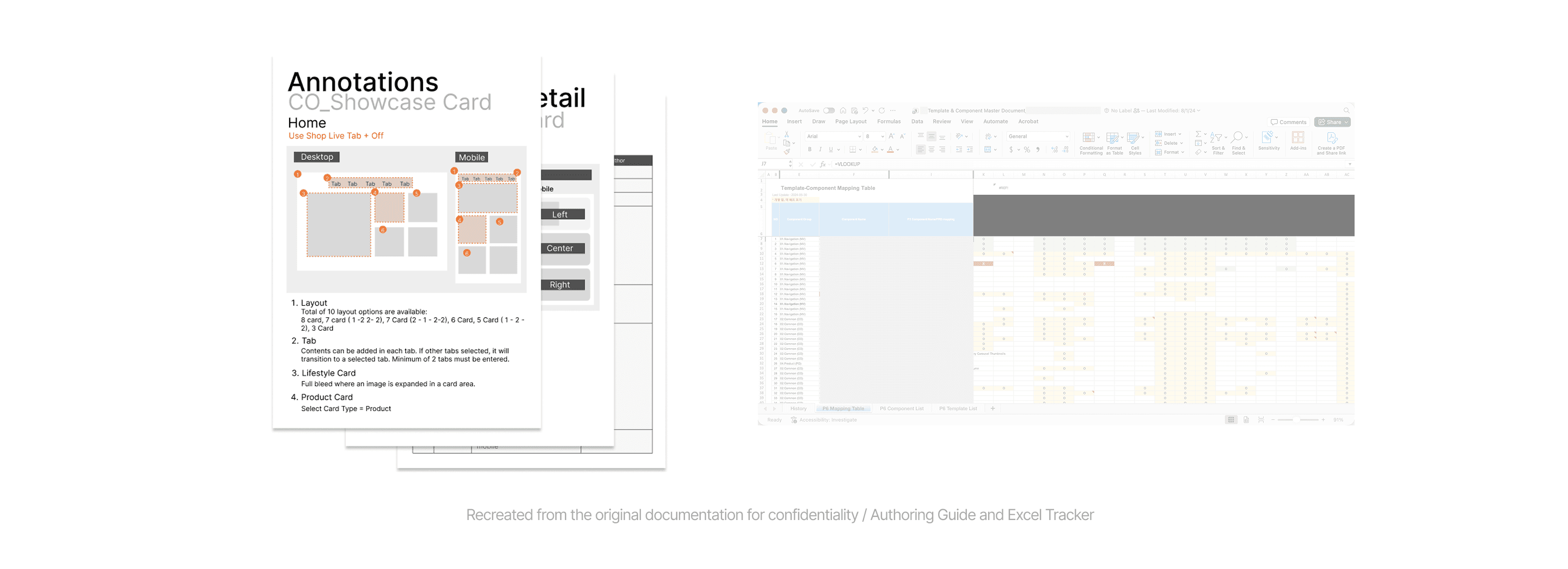
Component information lived across disconnected guides, trackers, and files.
Knowledge dependency
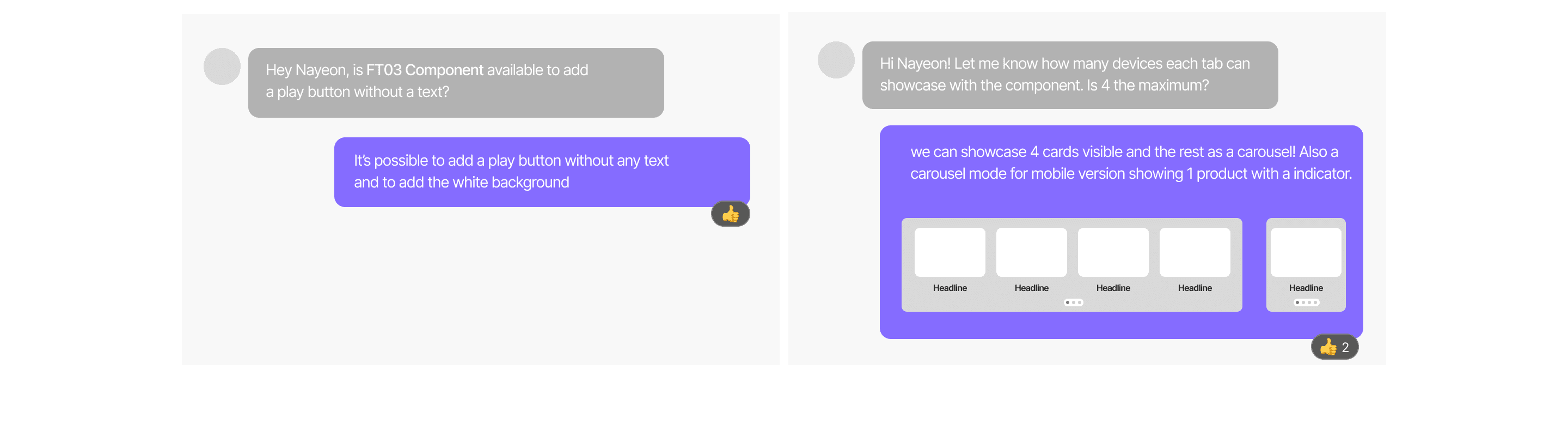
Usage guidance often depended on asking someone who already knew the answer.
Design Principles
Work faster, together
Make components easier to find and apply, reducing time spent searching through scattered guides and trackers.

One source of truth
Centralize components and documentation so teams can quickly access reliable, up-to-date guidance.

Every teammate, aligned
Give designers, PMs, and partners a shared understanding of how components work and when to
use them.

While applying the system..
Rather than simply recreating existing components, I focused on capturing the rules behind them—when they should be used, how they behave responsively, and what variations designers actually needed.

Scaling the system


Looking ahead
Outcome
→ Production time dropped noticeably — teammates no longer rebuilt the same patterns from scratch on every launch.
→ Consistency held up even as multiple designers worked independently across different launches.
→ Handoff friction eased, with fewer implementation discrepancies once components shipped with clear, documented specs.
Reflection
The Value of shared understanding
The harder part was getting a team of designers with different habits to actually adopt a shared system instead of quietly working around it. That meant treating documentation and rationale as seriously as the components themselves: a library nobody understands the "why" behind doesn't get used, no matter how well it's built.
This project also reframed how I think about working within someone else's brand system: the constraint wasn't the ceiling, it was the foundation I was responsible for building well on top of.